If you browse Dribbble, you’ll see that the number of learning management system design ideas goes way over 10,000 shots. Such a statistic is, in fact, easily explainable. According to the 2020 LinkedIn Workplace Learning Report, 57% of L&D departments want to increase their time and financial commitment to online learning over the coming year.
It’s crucial to develop your product visually appealing and user-friendly. However, no less vital is making it well-thought-out from a UX point of view, having clear logic, and being in touch with its initial purpose.
In this article, we will discuss the importance of learning management system UI/UX, key components of a compelling LMS outlook, and cover top LMS website designs based on our 3+ years of experience in product design and UX research. Below, we will share our work examples to reveal our expertise in a practical way.
The Importance of LMS Website Design
The answer to why you should take extra effort in designing a custom LMS and look through LMS design inspirations is basically similar to why any product design should be conducted with due effort, research, and competence.
Conducting UX research, investing in unique UI development, and, as a result, working out the proper design solution will dramatically work toward user retention. Namely, it will allow reducing the churn rate. Otherwise, your users would choose your competitors since they don’t reach their goals during the process.
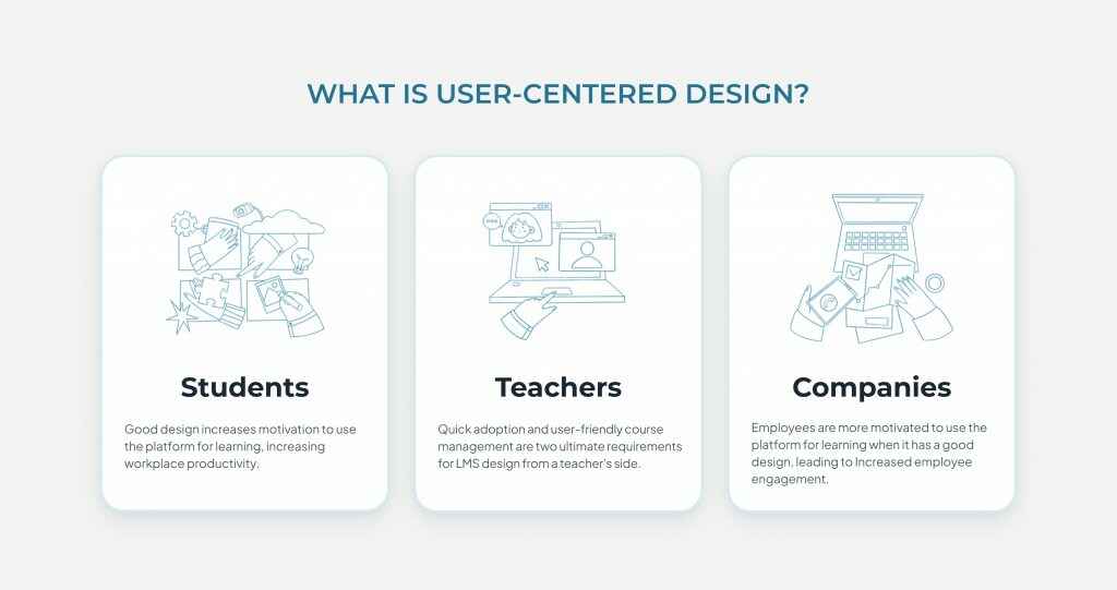
Let’s take a closer look at what functions and paths are crucial for three main types of LMS users: students, teachers and companies.
Students
In terms of learning management systems’ purpose as software, it would be fair to say its first and foremost audience is the student. Therefore, the entire idea of beneficial and quality LMS design should revolve around the ease of the learning process and how its architecture should help learners accomplish their primary task, which is studying.
With this idea in mind, we can break the student-oriented part of the design into two goals: education effectiveness and stress reduction.
The way that students study is greatly accelerated by responsive design and intuitive user interface. Users can concentrate on the course content when a learning tool has an intuitive user interface and an easy user experience. Knowledge retention thus improves. However, the outcomes are likely to be subpar if learners have to use a badly-constructed corporate LMS.
This is where the stress factor steps in. An inattentive and poorly designed LMS can put teachers and students under stress, lowering instruction’s efficacy
Follow our checklist to help learners eliminate stress during studying:
- Choose a design with the fewest unneeded and unresponsive parts possible.
- Ensure that displays load quickly.
- To clear up any potential system misunderstanding, provide students with advice on using the LMS.
- Pick an appropriate color palette, avoiding aggressive and overly-muted colors as the first might incentivize inner aggression, while the latter can work towards the feeling of reluctance.
Teachers
A teacher must create courses and launch the learning process as soon as they start utilizing an LMS. Obviously, the efficiency of education gets impacted if teachers find it challenging to build and maintain courses using an LMS. This brings us to two ultimate requirements for LMS design from a teacher’s side: the possibility of quick adoption and user-friendly course management.
Onboarding for teachers should be a feature of every new LMS. The convenient layout, inconsistent step orders, too much or too little information, etc., are some onboarding difficulties. If the LMS onboarding is designed with the end user’s needs in mind, good UI/UX design reduces these annoyances.
Moreover, fast course adjustments should be possible for instructors. This is true for adding and updating content, scoring assignments, and providing comments to students. The web and mobile LMS versions should both provide course administration tools.
Companies
Since the UI/UX is an essential component of the platform, it also affects how effectively the learned information is retained. In fact, the platform’s ROI may grow by having a carefully thought-out LMS.
Employees are more motivated to use the platform for learning when it has a good design since it is easier to use. Corporate users will gain more abilities that can be used in the workplace if they use an LMS more frequently. Overall workplace productivity rises as a result.
Key Components Of Great LMS Website Design
Before the learning management system finds its client, the latter usually goes through the website. As a rule, top LMS website design examples hit several birds with one stone. There’s no definite number of rules to follow to make your design ultimately winning.
However, specific design hints might help you make the website design more noticeable. Let’s look at them more thoroughly.
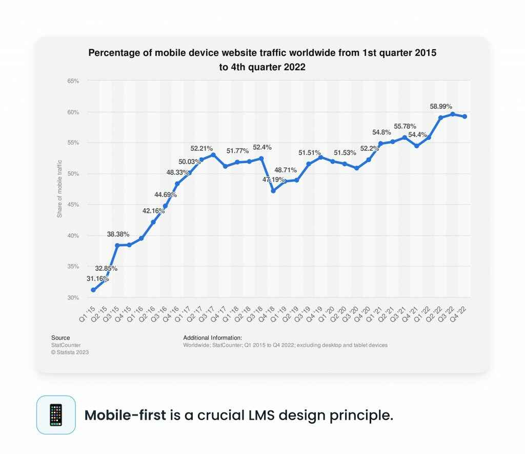
Mobile-first
While the classic designing approach is about developing a full desktop version in the first place, we suggest you try out a vice-versa approach, namely going mobile-first.
Firstly, 55% of first page views come from mobile phones. Secondly, designing a smaller screen allows focusing on key UI elements, which reduces the number of further amendments when adapting the solution for the desktop edition. This rule applies both to website and product designs.
Modern website design
While the times of underestimating the necessity of a website for a business are long gone, there’s still a point to prove concerning the page’s design. Your website must be modern and look as good as the product itself.
The website is an essential part of the package. In marketing, this is a blanket term for mediums that lead a consumer to the product, serving as a package between them and the solution in question. It makes sense, therefore, to make the package appealing and one that can speak the user’s language – literally and figuratively.
If you let the user experience a pleasing UI and understandable functionality from the first contact, it will serve as a compelling incentive to continue their journey down the sales funnel.
Early and often CTAs
Although the primary purpose of any product website is to inform visitors, its primary focus should be on turning those visits into leads. Incentivize your visitors to set up demos, begin free trials, and consume blog articles. In a nutshell, always ask visitors to take action.
More visuals, less text
Albert Einstein said once: “if you can’t explain it simply, you don’t understand it well enough.” In a nutshell, this is how it works for landing copy and CTAs.
Find out what matters to your audience so you can write less and be more focused. Less text and more visuals and white space ought to be the outcome. Knowing that a website’s goal is to provide customers with just enough information to elicit a response is helpful.
Therefore, don’t say everything. Be a little mysterious. Give the audience the better portion of the narrative, and tell them to get in touch with you for the remainder.
Top-10 Best-Designed LMS Websites for Inspiration
Let’s browse through the top examples of LMS design inspiration we have selected for you as a reference for possible future ideas. We hope these examples of LMS designs will lead you to some genuinely creative and beautiful ideas.
Arlo
Arlo is a training management software whose main audience is commercial training providers who want to automate their data. They provide a turn-key solution, offering not just training management but also connecting all the systems to use in one place.
Arlo’s design is minimalist yet eye-catching and clean. The website is conveniently divided into screens, each offering an appropriate CTA, while the carefully picked yellow color makes the user retain their attention.
LeanWorlds
LeanWorld’s website is more saturated than Arlo’s. However, it doesn’t take less of a product presentation. This website’s great thing is the convenient division of blocks and an emphasis on visuals (a lot of pictures, infographics, and other graphic materials).
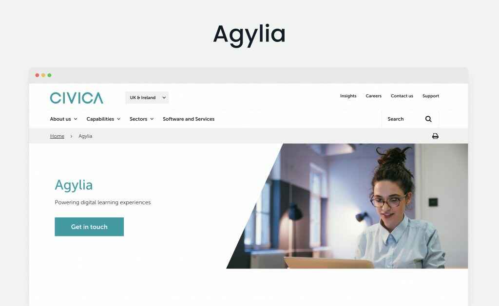
Agylia
Agylia offers a clean website, balancing visual material, texts, and CTAs. While the background is transparent, you can clearly feel the trinity of dark mint, blue and purple.
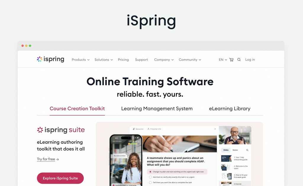
iSpring
iSpring fills its website with color on blank: bright tones are accompanied by clear white space, which works as a great visual solution. While the site features many elements, the user path is still apparent and understandable.
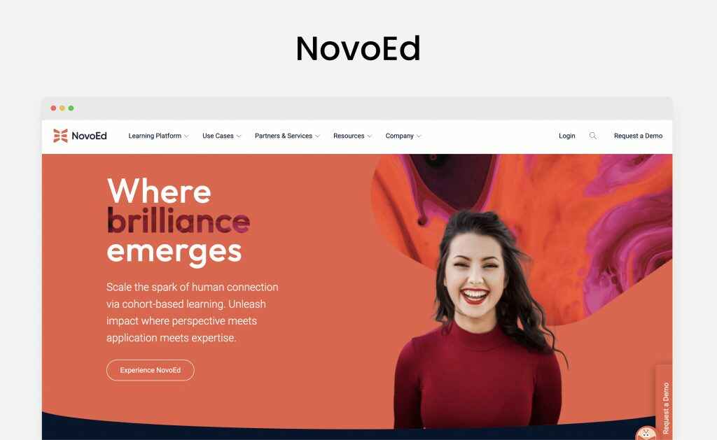
NovoEd
Among all the candidates, it’s NovoEd who does the best job in saying less and working with call-to-actions. Its design elements are distinct, one of the musts for CTAs to get to the user.
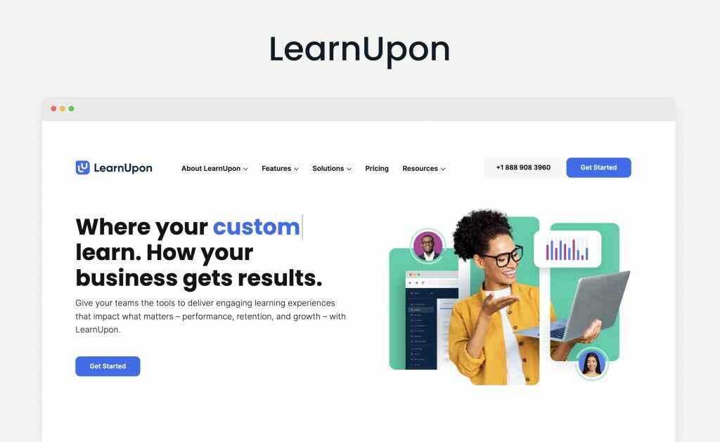
LearnUpon
LearnUpon’s website is very interactive at first glance: it immediately offers a support chat, offering to talk to a live agent as one of the possible options, and it also features animated design elements. Additionally, the website is colorful, which contributes to the positive aesthetic impression.
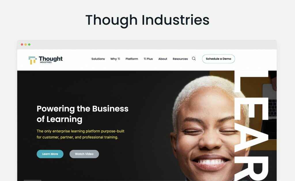
Thought Industries
The site of Though Industries is not minimalistic at all. However, this plays a winning card for this enterprise learning platform as the design harmonically combines copyrights, CTAs and helpful data.
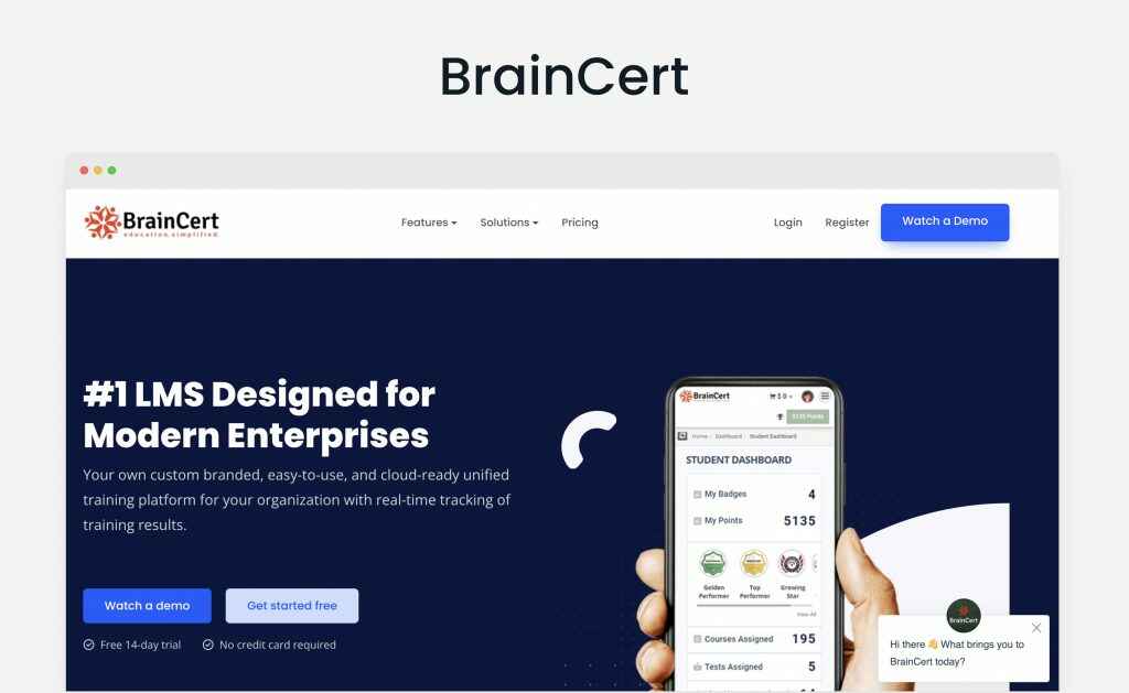
BrainCert
BrainCert designed their website with smooth shapes, fonts, and colors. In the endgame, these tactics work toward a pleasant user experience, which indeed is an achievement on the way to purchase.
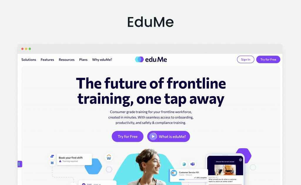
EduMe
Just like a couple of other websites mentioned above, EduMe goes for a triad of key colors: this time, it’s light blue, violet, and dark, almost black blue as a font color. Notice the background is not clear-white: if you take a closer look, you’ll notice it’s actually light grey, which visually adds up to an overall color balance.
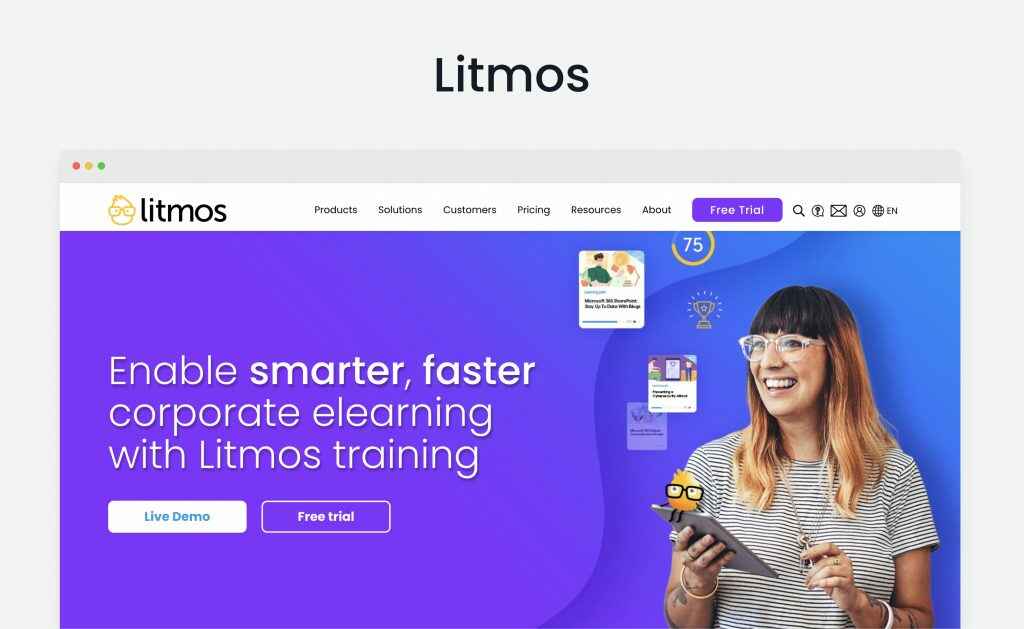
Litmos
Litmos goes for clean UI while designing their website: it has a good combination of offered services, case studies, useful statistics and clear CTAs.
WeSoftYou Is Ready to Become Your Reliable Partner
WeSoftYou has proven expertise in custom LMS development, possessing a number of learning management system design inspirations. Our designers work their best on external projects: get acquainted with what we offer below.
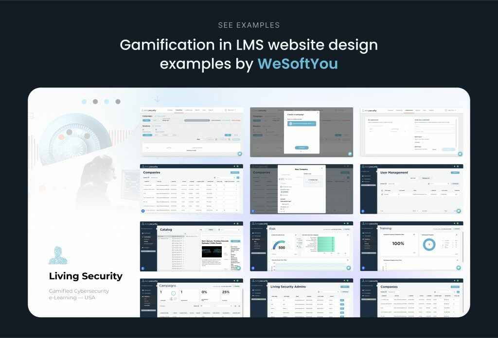
Security Training Design
Living Security is a web platform for Fortune 500 companies that offers gamified cybersecurity e-learning. It offers immersive cyber security training through an experience of an “escape room.”
The WeSoftYou team contributed to digitizing current security awareness training and created the first fully remote human risk management platform for cyber security. We make it available to more than 1000 companies worldwide to assist them in educating staff members about secure online behavior. While designing Living Security, the WeSoftYou team aimed to engage users in the learning process with a game.
The product included two main modes: for group learning and individual training. The solution includes basic features like admin panels, reporting and leaderboard, as well as the cherry-on-top gaming section. The latter interacts with the users via video, audio and chat. It also allows placing the leader’s name on the leaderboard for company training mode.
The portal provides several narratives, including sets of instructional videos, questions, and puzzles to provide complete gamification. For training at any time and everywhere, the software now includes 1-3 minute nano- and micro-learning modules that are simple to understand and recall.
Living Security’s cutting-edge individual and team training programs provide measurable, long-lasting changes in user behavior by properly measuring weaknesses and strengths and identifying possible gaps.
Design Your Next LMS with WeSoftYou
Best LMS website designs hit the goals of modern aesthetics, understandable user experience, and work toward clients’ growth and retention. Trusting this work to professionals is thus critical: UI/UX designers with proper expertise will help you prototype the product that hits all of the above targets.
Consider WeSoftYou team of designers and developers to work with your product. Our team can work with you in several engagement models, deliver scalable LMS for business or school management, self-education, or AI education software. We will walk you through advisory, development and deployment stages and ensure transparency all the way through. Let’s talk about your LMS design inspiration and unite our efforts to bring it to fruition.
FAQ
Several key challenges to creating best designed LMS websites include developing several iterations of user interfaces (for students, teachers, administrators or other parties), clear navigation, mobile responsiveness, and integration with other systems.
To create best LMS design software, follow the four steps of design development.
Define the functional and non-functional requirements of your software, it’s target audience and key purpose (who will use it and why).
Research and evaluate existing LMS solutions to get inspiration from learning management system design ideas.
Start prototyping and follow your research.
Test and refine your design with a small user focus group.
Creating your own LMS design can be a complex and time-consuming process, but it can also be a rewarding and cost-effective way to meet your specific needs and requirements. Consider working with a development partner such as WeSoftYou to help ensure that your LMS design is effective and meets your needs.
Yes, product designers from WeSoftYou are available for hire. We have a lot of learning management system design examples in our portfolio, and our managers will be happy to help you assemble your next team of designers for your project.
Custom LMS design cost estimate is formed with several factors. Normally, it’s influenced by the design’s scalability, amount of customization, working team seniority, design’s integration with third-party services, and the development method in question.
Typically, the cost of creating a custom LMS design can range from a few thousand dollars for a simple design to hundreds of thousands for a larger, more complex design. If you require more precise financial estimations, contact the WeSoftYou team.
The time it takes to build a learning management system design can vary greatly depending on several factors, including its complexity and size, customization, resources, and nuances of integration.
On average, it can take anywhere from a few months to a year or more to build an LMS design, depending on the factors mentioned above. However, it is vital to remember that the development process is not just limited to the design phase and that the development of an LMS can be complex and ongoing.


![How to Develop a GPS Navigation App: [Citymapper & Waze Cases Included], image #7](https://wesoftyou.com/wp-content/uploads/2023/07/pexels-samson-katt-5226497-scaled.jpg "How to Develop a GPS Navigation App: [Citymapper & Waze Cases Included], image #7 - WeSoftYou")